CSS Timing Functions
May 18th, 2014 by Rossy GuideWhat is this?
The <timing-function> CSS data type denotes a mathematical function that describes how fast one-dimensional values change during transitions or animations. This in essence lets you establish an acceleration curve, so that the speed of the animation can vary over its duration. These functions are often called easing functions. People of the world, strap yourself in and hold on tight, for you are about to experience truly hair-raising excitement as you get to grips with the intricacies of the hugely interesting CSS timing function!
It is a function linking the time with a ratio of the output value, expressed as a <number>, with 0.0 representing the initial state, 1.0 the final state. The output ratio can be greater than 1.0 (or smaller than 0.0). This causes the animation to go farther than the final state, and then come back, in a kind of bouncing effect.
Nevertheless, if the output value goes outside of its possible range, such as a component of a color going greater than 255 or smaller than 0, the value is clipped to its closest allowed value (in the case of a color-component 255 and 0 respectively. Some cubic-bezier () curves exhibit this property.
How to understand it?
First of all, let’s set the scene and ensure we’re all familiar with the scenarios in which the timing function is relevant. As alluded to, the functionality becomes available when you’re working in the realm of CSS animation, which includes CSS transitions as well as keyframe-based animation.
The CSS Timing Function Explained:
It’s one of the less obvious animation-based CSS properties, whereas most of its counterparts are rather self-explanatory. Nevertheless, the gist of it is that it enables you to control and vary the acceleration of an animation; it defines where the animation speeds up and slows down over the specified duration.
While it does not affect the actual duration of an animation, it could have profound effects on how fast or slow the user perceives the animation to be. If you’re not sold having learned of its actual purpose, then stick with me here because the timing-function property gets a lot more interesting than the definition suggests.
Before moving on, let’s just familiarize ourselves with the syntax and where it fits into the whole process of defining an animation in CSS. To keep things simple, let’s use a CSS transition for this example. We’ll begin with the full array of transition properties:
| div {transition-property: background;transition-duration: 1s;transition-delay: .5s;
transition-timing-function: linear; } /* This could, of course, be shortened to: */ div { transition: background 1s .5s linear; } |
Looking Under the Hood:
Many of you probably don’t look past the available keywords for the timing-function property, of which there are five: ease (the default), ease-in, ease-out, ease-in-out and linear. However, these keywords are simply shorthands for defining the Bezier curve.
That’s right, when you use the Pen or Path tool to create a nice smooth curve, then you’re drawing a Bezier curve! Anyway, to get to the point of this section, the Bezier curve is the magic behind the timing function; it basically describes the acceleration pattern on a graph.
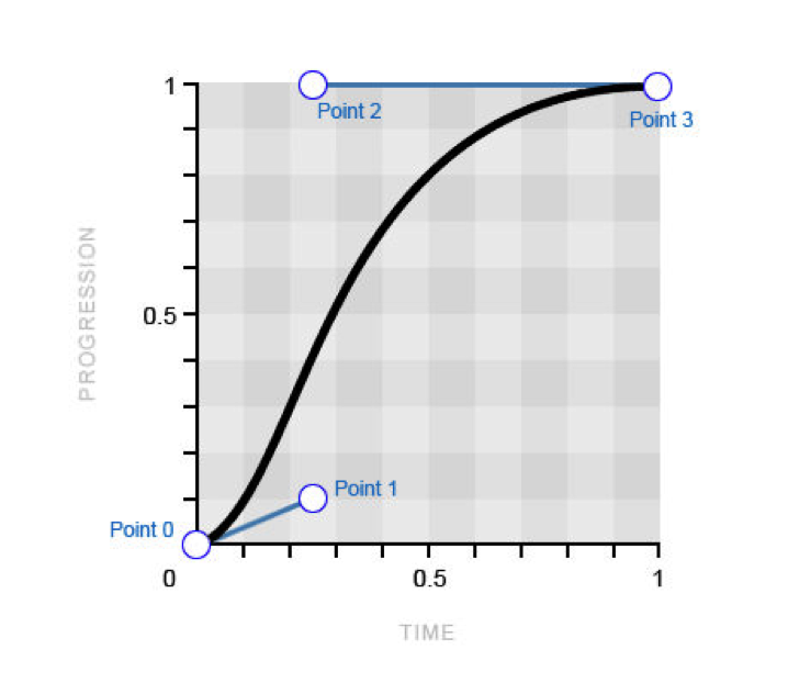
Introducing the cubic-bezier() Function
Now then, this really is where things get really exciting, as I reveal that you can certainly get access to this curve through the cubic-bezier() function, which can simply be used set up of the keywords of the timing-function property value. I appreciate that you might need a moment to contain your excitement… With the cubic-bezier () function, you can manipulate the Bezier curve whichever way you desire, creating completely custom acceleration patterns for the animation! So, let’s examine how this function works and how it enables you to definitely create your personal Bezier curve.
| transition-timing-function: cubic-bezier(x, y, x, y); |
Introducing the steps() Timing Function:
The steps() function is more of a nice tool, but it’s useful to have in the toolkit nonetheless. It enables you to break up an animation into steps, rather than the usual tweened motion that we’re used to.
div {
}
div:target {
}
|
Creative Use Cases for Stepping Functions:
So you probably don’t have much of a need to animate a moving box in steps very often, but there are plenty of other cool uses for the steps() function. For example, if you have all of the sprites for a basic cartoon, then you could use this technique to play it through frame by frame, using just a couple of CSS properties! Let’s look at a demo and the code that makes it function.
div {
}
div:target {
}
|