
Measuring Transfer Impact on the Network
Every fix in this series — a throttle, a scavenger class, a window, a connection cap — is a claim that something got better. Without measurement, that claim is an opinion, and opinions lose arguments to whoever complains loudest. The administrator who can say "the link peaked at 96 percent for eighty minutes on Tuesday. Latency for the branch went from 18 to 340 milliseconds. And 70 percent of the bytes were the backup account" gets the window approved. The one who says "I think it's the backup" gets a ticket reassigned.
This article is about the measurement that makes bandwidth management stick. It covers what three numbers to watch and how to read them from interface counters on the transfer host. It explains what the network team's SNMP graphs show and hide, and how to spot saturation from a rising ping. It shows how to work out from server logs which account or job took what share. It covers how to compare before and after a change honestly. It shows how to turn it all into a weekly report short enough that someone reads it. It is the last article in our Bandwidth Management series. Measuring the speed of a transfer as a benchmark is a different discipline, covered in our Benchmarking Transfer Performance series. This article is about the effect a transfer has on everyone else.
The Three Numbers
Bandwidth impact comes down to three measurements, and everything else in this article is a way of obtaining one of them.
Utilization is how full the link is: bytes sent per second, divided by the link's capacity, expressed as a percentage. It is measured at an interface — on the edge router by the network team, or on the transfer host by you. It is always measured in one direction at a time, because a link that is 96 percent full outbound may be 20 percent full inbound.
Latency under load is the round-trip time other users experience while the transfer runs, compared with the round-trip time when it does not. Utilization says the link is busy; latency says whether that busyness is hurting anyone. A link at 90 percent with stable latency is a link with good queue management. A link at 90 percent with latency ten times its idle value is a bloated buffer, as described in why bulk transfers crush the WAN.
Per-flow share is how the bytes divide between jobs, accounts, and partners. This is the number that turns "the link was full" into "the backup account moved 31 GB between 16:00 and 17:20." It comes from server and job logs rather than from the network. With these three you can set a bandwidth budget for each flow. That is an agreed amount of bytes per day and an agreed ceiling during business hours. You can check it weekly.
Reading Interface Counters
Every network interface keeps a running count of bytes sent and received since boot. Read the count twice, subtract, divide by the seconds between readings, and multiply by eight. You have the average rate in bits per second over that interval. That is all a utilization graph is: this calculation, repeated and plotted. The first article in this series used it once by hand. Here it becomes a logger that writes a line every minute so you have a record to look back at.
#!/bin/bash
# ratelog.sh: append "time,tx_mbit,rx_mbit" for eth0 every 60 seconds
IF=eth0; OUT=/var/log/ratelog.csv
t1=$(cat /sys/class/net/$IF/statistics/tx_bytes)
r1=$(cat /sys/class/net/$IF/statistics/rx_bytes)
while sleep 60; do
  t2=$(cat /sys/class/net/$IF/statistics/tx_bytes)
  r2=$(cat /sys/class/net/$IF/statistics/rx_bytes)
  printf "%s,%d,%d\n" "$(date +%H:%M)" $(( (t2-t1)*8/60/1000000 )) $(( (r2-r1)*8/60/1000000 )) >> $OUT
  t1=$t2; r1=$r2
done

# One-off views without a script:
ip -s link show eth0          # totals since boot
sar -n DEV 5 12               # 12 samples, 5 seconds apart, per interface
On Windows, the same counters are available through PowerShell or the built-in performance counters. typeperf is the quickest way to log them to a file:
# Bytes sent per second, sampled every 60 seconds, 1440 samples (one day), to CSV
typeperf "\Network Interface(*)\Bytes Sent/sec" -si 60 -sc 1440 -f CSV -o C:\logs\ratelog.csv

# Quick check of the totals since boot
Get-NetAdapterStatistics -Name "Ethernet" | Select-Object SentBytes, ReceivedBytes
Remember that typeperf reports bytes; multiply by eight for bits. Keep the resulting file for at least a month. A spreadsheet chart of it is a perfectly good utilization graph, and it has one advantage over the network team's. It shows what this host sent, so a spike on it is unambiguously a transfer from this machine.
SNMP in Plain Words
The network team's graphs come from SNMP (simple network management protocol). It is nothing more mysterious than a way for a monitoring server to ask a router "what is the value of your outbound byte counter?" every few minutes. The router answers with the same kind of running count you just read from /sys. The monitoring server subtracts the previous answer and plots the rate. The counters have names — the 64-bit ones are called ifHCInOctets and ifHCOutOctets — and you may hear them, but you never need to touch them. What you do need is read access to the graph of the WAN interface. That is a reasonable thing to ask for. Most network teams grant it to a colleague who asks with a specific reason.
There is one thing SNMP graphs routinely hide, and it matters for transfers: the polling interval. Most monitoring polls every five minutes, so each point on the graph is the average over five minutes. A transfer that pins the link at 100 percent for ninety seconds and then stops shows on a five-minute graph as a bump to 30 percent. The phones froze for ninety seconds; the graph says nothing happened. The diagram below shows the difference.
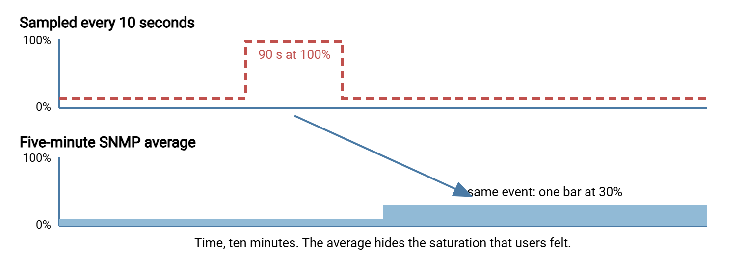
Two consequences. When you are hunting a specific problem, ask for one-minute polling on the WAN interface for a week, or rely on your own per-minute host logger, which sees the peak. And when you read a long-term graph, look at the 95th percentile line if the tool draws one. It is the level the link stayed below for 95 percent of the intervals. This ignores the very worst spikes but is far more honest than the average. A link whose 95th percentile sits above 80 percent of capacity during business hours is a link that is saturated regularly, whatever the average says.
Spotting Saturation from Latency
Utilization needs access to counters; latency needs only a ping. A steady stream of pings from inside the site to the first router on the far side of the WAN link is the cheapest saturation detector there is. Log it with timestamps. A full queue shows up as a jump in round-trip time before anyone has opened a ticket. The idle baseline for a branch circuit is typically tens of milliseconds and stable; under a bulk transfer it rises into the hundreds and wanders.
# Linux: one ping every 5 seconds to the far side of the link, timestamped
ping -i 5 10.20.0.1 | while read line; do
  echo "$(date +%H:%M:%S) $line"
done >> /var/log/pinglog.txt

# Sample lines: idle, then the backup starts at 16:00
15:58:10 64 bytes from 10.20.0.1: icmp_seq=21 ttl=62 time=18.4 ms
16:00:35 64 bytes from 10.20.0.1: icmp_seq=50 ttl=62 time=287 ms
16:00:40 64 bytes from 10.20.0.1: icmp_seq=51 ttl=62 time=341 ms

# PowerShell equivalent (older Windows PowerShell names the field ResponseTime)
while ($true) { $r = Test-Connection 10.20.0.1 -Count 1
  "{0:HH:mm:ss} {1} ms" -f (Get-Date), $r.Latency >> C:\logs\pinglog.txt
  Start-Sleep 5 }
A working rule of thumb: suppose the loaded round trip is more than three times the idle round trip. If it stays that way for longer than a minute, the link is saturated and the queue is bloated. Line the ping log up against the rate log by time and the picture is complete. The rate log says the host was sending 48 Mbit/s. The ping log says latency went to 300 ms at the same minute. The two together are the evidence pack from the first article, now collected automatically. Note that the ping target must be beyond the congested link; pinging the local router tests only the LAN. The subtler question of whether a transfer is slow because of latency or because of bandwidth is a diagnosis in its own right, covered in our Diagnosing Slow Transfers series.
Per-Flow Accounting from Server Logs
Counters tell you the link was full; logs tell you who filled it. Every transfer server records each session and, in most cases, the bytes moved per file. So a few lines of text processing produce a table of bytes per account per hour. That table is the basis for fairness discussions, partner conversations, and the per-flow budget.
OpenSSH's SFTP server logs at the INFO level when its subsystem line is configured with -l INFO. Each file close then produces a line with the bytes read and written, and each session start names the account. The script below joins the two by process id and sums bytes per account per hour. The log format is the usual syslog one, with lines like Mar 14 02:10:33 sftp01 sftp-server[4821]: close "/inbound/backup.tar" bytes read 0 written 31457280000.
awk '
  /sftp-server\[[0-9]+\]: session opened for local user/ {
    match($0, /sftp-server\[[0-9]+\]/); pid = substr($0, RSTART, RLENGTH)
    for (i = 1; i <= NF; i++) if ($i == "user") acct[pid] = $(i+1)
  }
  /sftp-server\[[0-9]+\]: close / {
    match($0, /sftp-server\[[0-9]+\]/); pid = substr($0, RSTART, RLENGTH)
    hour = substr($3, 1, 2); r = 0; w = 0
    for (i = 1; i <= NF; i++) { if ($i == "read") r = $(i+1); if ($i == "written") w = $(i+1) }
    bytes[acct[pid] " " hour] += r + w
  }
  END { for (k in bytes) { split(k, p, " "); printf "%-12s hour %s  %8.2f GB\n", p[1], p[2], bytes[k] / 1e9 } }
' /var/log/auth.log | sort

# Sample output (bytes count in the hour the file closed)
backup       hour 17      31.46 GB
partner-a    hour 09       5.80 GB
partner-b    hour 09       0.41 GB
Read as a share, that is the whole story of the afternoon: one account moved 31 GB, finishing in the hour the phones failed. Traditional FTP servers keep a transfer log with one line per file including the byte count and account, which sums the same way with a simpler script. Windows transfer servers keep activity logs in their own format. A server such as Sysax Multi Server records per-account activity that can be exported and summed by account and hour in a spreadsheet. That is entirely adequate for a weekly report. Whatever the source, the techniques for reading these logs, and for gathering them from several servers into one place, are in reading transfer logs and centralizing logs.
Job logs fill in what server logs cannot. A scheduled job that records its own start time, end time, and bytes moved gives you the per-job view directly. That includes jobs that push to a partner's server whose logs you will never see. Both rsync and lftp print totals at the end of a run. Capturing those lines into the job's log is a one-line change that pays for itself the first time a partner asks why their file was late.
Remember: the network sees bytes; only the logs see names. Keep both. A utilization spike with no matching log entry means an unmanaged transfer exists somewhere, and finding it is more valuable than any throttle.
Before-and-After Comparisons That Hold Up
Every change in this series should be followed by a comparison, and a comparison is only fair if the two sides differ in one thing. The rules are the same ones that make a benchmark honest, spelled out in why transfer benchmarks lie, but the impact version is short.
- Same job, same weekday, same hour. Tuesday's backup against Tuesday's backup a week later. Monday and Friday traffic differ; month-end differs from everything.
- Same three numbers each side. Peak utilization, loaded latency, and the flow's bytes and duration. Record all three even when only one was expected to change, because the throttle that fixed latency may have pushed the job past its window.
- Normalize for size. If the job moved 30 GB one week and 36 the next, compare megabytes per second and minutes per gigabyte, not wall-clock time.
- Note what else changed. A partner's server upgrade, a new application at the site, a carrier fault. One line in the record saves an hour of confusion later.
| Measure | Before (backup at 16:00, unthrottled) | After (moved to 01:40, scavenger mark) |
|---|---|---|
| Peak outbound utilization, business hours | 96% | 44% |
| Loaded latency to far side, business hours | 340 ms | 21 ms |
| Backup bytes and duration | 31.5 GB in 82 min | 31.8 GB in 79 min |
| Helpdesk tickets mentioning phones or RDP | 4 | 0 |
The last row is not a network measurement, and it is the one management reads. Keep it.
The Weekly Report
Measurement that nobody looks at decays into measurement that nobody collects. A weekly report, one page, the same layout every week, is what keeps windows from silently shrinking and partners from silently widening. It should take fifteen minutes to produce from the logs above and thirty seconds to read.
| Section | Contents | Where it comes from |
|---|---|---|
| Link health, per WAN link | Business-hours peak and 95th percentile; hours above 80%; worst loaded latency | SNMP graph or rate log; ping log |
| Top flows | Five largest accounts or jobs by bytes, with share of total and daytime bytes | Server log accounting |
| Budget check | Each budgeted flow: agreed bytes and daytime ceiling versus actual; flag breaches | Accounting plus the inventory |
| Window health | Window fill percentage; jobs that overran, landed softly, or were deferred by admission control | Job logs |
| Unexplained | Utilization spikes with no matching job or account | Rate log versus accounting |
| Actions | At most three, each with an owner | You |
The budget line deserves a definition, because it is the thing this whole series has been building toward. A bandwidth budget per flow is a written agreement, per job or partner, of three numbers. These are bytes per day you expect, the ceiling during business hours (often zero, meaning "off-peak only"), and the window it runs in. The backup's budget might read "30 GB per night, zero daytime bytes, window 01:40 to 06:00." Partner A's might read "6 GB per day, 8 Mbit/s daytime ceiling, four connections." Once the numbers are written down, the weekly report is simply a comparison of actual against agreed. A breach is then a conversation with a name attached rather than a mystery. Where the report should live, and how to present it alongside job success and failure, is covered in transfer dashboards and reporting. The wider health of the server itself is the subject of our Transfer Server Health Monitoring series.
The Version to Tell a Colleague
Three numbers describe a transfer's impact: how full the link is, how much latency other users see while it runs, and which account or job moved the bytes. Interface counters on the host give the first. A timestamped ping to the far side of the link gives the second. Server logs summed per account per hour give the third. The network team's SNMP graphs are useful but average over five minutes, so ask for the 95th percentile and keep your own per-minute log when hunting a spike. Compare before and after on the same job and weekday, normalized for size, and record what else changed. Then write a one-page weekly report with a budget per flow, so that every limit in this series is checked against reality instead of remembered.
If you have read the series in order, the loop is now closed: the problem, the fixes, and the measurement that proves them. With a week of data in hand, one article most worth revisiting is off-peak scheduling, to check the window arithmetic against real fill. The other is fairness between flows, to see whether the top-flows table shows anyone taking more than their share.
Frequently Asked Questions
The network team's graph shows the link at 30 percent, but users say it was unusable. Who is right?
What is a 95th percentile, in plain words?
How do I find out which user or partner used the most bandwidth?
Where should I ping to detect saturation on the WAN link?
What goes in a bandwidth budget for a flow?
From the Sysax team: we build secure file transfer software for Windows. Sysax Multi Server is an FTP, FTPS, SFTP, and HTTPS server. Sysax FTP Automation handles scheduled, scripted transfers. Free trials are on the download page.