
A Simple Transfer Server Health Dashboard
Every article in this series has produced a number. There is a synthetic login that passes or fails, a disk percentage, a peak session count, a certificate's days remaining, and an error rate. Scattered across scripts and log files, those numbers are useless in a crisis, because nobody checks eight places at once. A dashboard is simply the act of putting them on one screen. A single glance answers the only question that matters at 9 a.m.: is anything wrong, and if so, what?
This article builds that screen with the lightest possible tooling — no monitoring product required. You will choose the eight to twelve tiles that belong on it and set a threshold for each. You will gather the numbers into a single JSON file with a short script, then render them as a plain HTML page or a spreadsheet. You will route the alerts by severity and run a weekly review ritual — the part that keeps a dashboard alive. This is the closing article of our server health monitoring series. It assembles everything the earlier articles collected into one view.
Why One Screen
The value of a dashboard is not the data — you already had the data. The value is consolidation: reducing the effort of a health check from eight commands to one look. A number that takes effort to find gets checked in a crisis and never otherwise. A number on a screen gets absorbed in passing, every day. That way, you notice the certificate at thirty days and the disk trending up before either becomes an incident.
Keep it honest about scope. This is a server health dashboard — the service, not the flows. Whether last night's file arrived belongs on a job dashboard, covered in transfer dashboards and reporting. The two screens sit side by side and answer different questions; conflating them produces a cluttered board that answers neither well.
There is a second, quieter benefit worth naming: a dashboard builds a shared picture. When the whole team looks at the same screen, "the server is fine" stops being one person's hunch. It becomes something everyone can see and agree on. That matters most during an incident. A calm, shared view of what is and is not on fire prevents the scramble where three people investigate three different theories. The board is as much a communication tool as a monitoring one.
The Tiles: Eight to Twelve, No More
A tile is one health signal, shown as a value and a color: green for healthy, amber for warning, red for critical. The discipline is to have few enough tiles that the whole board reads in one glance — eight to twelve is the sweet spot. Fewer and you miss something; more and the screen becomes wallpaper nobody reads. Here are the tiles that earn their place on a transfer server's board, each drawn from an earlier article in this series.
The diagram below shows a workable layout. Liveness goes across the top because it is the foundation. Resources go in the middle, and the slower-moving expiry and log signals go along the bottom.
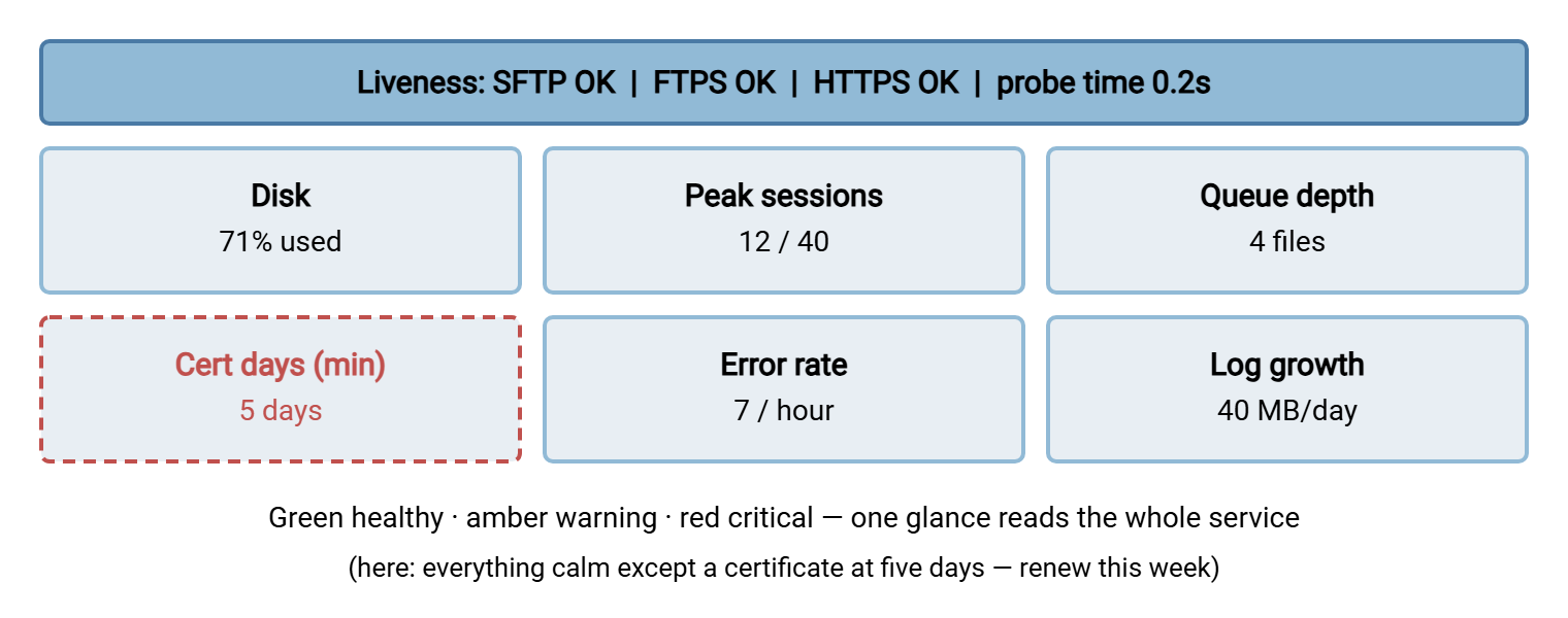
Reading that example board takes a second. Every resource is calm, but the certificate tile is red at five days, so the day's one job is a renewal. That is exactly what a dashboard is for. It makes the one thing that is not fine impossible to miss, rather than showing that things are fine.
Thresholds for Each Tile
A tile without a threshold is just a number; the threshold is what turns it a color. Set each from your own baseline, using the reasoning the earlier articles laid out. This table is a starting point — the full set of tiles with sensible warning and critical lines:
| Tile | Green | Amber | Red |
|---|---|---|---|
| Liveness (per protocol) | Login OK | 1–2 recent fails | 3+ fails in a row |
| Probe response time | Near baseline | 2× baseline | 5× baseline |
| Disk (per volume) | Below 80% | 80–90% | Above 90% |
| Peak sessions | Below 70% of cap | 70–90% | Above 90% |
| Queue depth | Near baseline | Several× baseline | Oldest past deadline |
| Certificate days (min) | Above 30 | 7–30 | Below 7 |
| Error rate | Near baseline | 2× baseline | 10× baseline |
| Log silence | Writing normally | — | No writes in expected window |
That is nine tiles — liveness counts once per protocol. So three protocols plus probe time, disk, sessions, queue, certificate days, error rate, and log silence lands comfortably in the eight-to-twelve range. Add a log-growth tile and a throughput tile if they matter on your server, and stop there.
Two of those tiles are deliberately split rather than summarized, and the reason is worth understanding. Liveness is per protocol because a single "service up" tile hides the case where SFTP works but FTPS is wedged. A summary that averages away a failure is worse than no tile at all. Disk is per volume for the same reason. A server that keeps logs, transfer data, and the system on separate volumes has three different ways to fill. One combined percentage would mask a log volume at ninety-eight percent behind a data volume at forty. When in doubt, split a tile that can hide a failure and summarize a tile that cannot. The one thing never to do is add a tile you will not act on. A number nobody responds to is decoration, and decoration trains the eye to skim the whole board.
Gathering the Numbers Into One File
The dashboard reads from a single file that every collector writes into. JSON is a good choice because it is structured, human-readable, and trivial for a web page to load. A short script runs on a schedule, gathers each metric, and writes one JSON document that is the dashboard's single source of truth. This example pulls together the collectors from the earlier articles:
# build-health-json.ps1 -- one health snapshot for the dashboard
$live   = (Test-Path D:\health\live.ok)          # written by the synthetic login
$freePct = [math]::Round((Get-Counter '\LogicalDisk(C:)\% Free Space').CounterSamples.CookedValue,1)
$sess   = (Get-NetTCPConnection -LocalPort 2222 -State Established).Count
$queue  = (Get-ChildItem D:\transfer\outbox -File).Count
$certMin = (Import-Csv D:\health\expiry.csv | Measure-Object DaysLeft -Minimum).Minimum
$errRate = [int](Get-Content D:\health\errrate.txt)

$health = [ordered]@{
    updated    = (Get-Date -Format "MMM dd HH:mm")
    liveness   = if ($live) { "OK" } else { "FAIL" }
    disk_used  = 100 - $freePct
    sessions   = $sess
    queue      = $queue
    cert_days  = $certMin
    error_rate = $errRate
}
$health | ConvertTo-Json | Out-File -Encoding utf8 D:\health\health.json
The resulting file is small and readable, which is a feature. You can open it and understand the whole state of the server at a glance even without the rendered page:
{
  "updated": "Mar 14 09:00",
  "liveness": "OK",
  "disk_used": 71,
  "sessions": 12,
  "queue": 4,
  "cert_days": 5,
  "error_rate": 7
}
Keep the collector simple and give it the error handling any unattended job needs, as in PowerShell error handling and logging. A health collector that fails silently is the very thing this series warns against. On Windows it runs from Task Scheduler; the scheduling mechanics are in Task Scheduler for transfers.
Store two things, not one. The snapshot above is the current state, overwritten each run, and it is what the dashboard reads to paint today's colors. Separately, append each run's numbers to a history file — the same CSV the core-metrics collector builds. The snapshot cannot show a trend, and trends are where the weekly review lives. A dashboard that only ever knows "now" can tell you the disk is at seventy-one percent but not that it was at sixty last week. Keeping the history alongside the snapshot costs one extra line in the collector. It unlocks every trend question you will want to ask later.
One caution on the collector's timing: gather each number close together, within the same run, so the snapshot is internally consistent. A dashboard may mix a disk reading from one minute with a session count from ten minutes ago. That can tell a confusing story during a fast-moving incident. Running all the collectors from one scheduled script, writing one file at the end, keeps every tile describing the same instant.
Rendering It: A Page or a Spreadsheet
You do not need a graphing platform to render this. Two light options cover almost everyone.
The first is a plain HTML page that loads the JSON and colors a grid of tiles. It is a single static file you can drop on any internal web server or even open from a file share. It reads the JSON, compares each value to its thresholds, and sets the tile color. The core of it is a few lines — here is the shape, with the markup escaped so you can see the structure:
<div id="tiles"></div>
<script>
fetch('health.json').then(r => r.json()).then(h => {
  const tile = (label, value, status) =>
    `<div class="tile ${status}">${label}<br>${value}</div>`;
  const diskStatus = h.disk_used > 90 ? 'red'
                   : h.disk_used > 80 ? 'amber' : 'green';
  const certStatus = h.cert_days < 7 ? 'red'
                   : h.cert_days < 30 ? 'amber' : 'green';
  document.getElementById('tiles').innerHTML =
      tile('Liveness', h.liveness, h.liveness === 'OK' ? 'green' : 'red')
    + tile('Disk used', h.disk_used + '%', diskStatus)
    + tile('Cert days', h.cert_days, certStatus);
</script>
Have the page refresh itself every minute, point a spare monitor at it, and you have a live wall-board for the cost of one file. The second option is a spreadsheet. Import the JSON or a CSV, use conditional formatting to color cells by their thresholds, and let it refresh on open. It is less pretty but requires zero web skills, and for a small team it is often the fastest path to a working board. Either way, the rendering is deliberately dumb — the intelligence is in the thresholds, not the tool.
One design detail elevates a plain board from useful to trustworthy: show the age of the data. Put the snapshot's updated time somewhere on the page. Color it red if it is stale — older than a couple of collection intervals. A frozen dashboard that keeps showing yesterday's cheerful greens is the most dangerous state of all. It actively reassures you while the server burns. A visible, self-checking timestamp turns "the board looks fine" into "the board is fine and current," which are very different claims. This is the dashboard applying to itself the silent-log lesson from the log health article: the absence of fresh data is itself a signal.
Remember: the dashboard is a mirror, not a brain. All the judgment lives in the collectors and the thresholds; the page or spreadsheet just paints the result. That is why you can build it with a static file. It is why swapping the renderer later changes nothing about how the server is actually watched.
Every Alert Links to a Runbook
A red tile that tells you what is wrong but not what to do wastes the most valuable minutes of an incident. The fix is a rule: every tile links to a runbook — a short, specific document that says how to fix that exact condition. The disk tile links to "what to delete or archive when disk is critical." The certificate tile links to "how to renew and install a certificate." The liveness tile links to "how to restart the service and confirm it came back."
These runbooks do not have to be elaborate; a half-page of concrete steps beats a polished document nobody wrote. The point is that the dashboard becomes a launchpad: see red, click through, follow the steps. Writing runbooks per flow and per condition is the subject of the Group V pillar on documenting transfer flows. It is what separates a dashboard that informs from one that actually shortens outages.
There is a compounding benefit here. The moment a red tile has a runbook behind it, a junior admin can respond to that condition without waking the person who built the system. That is how a health dashboard scales a small team. The knowledge of how to fix each condition lives in the linked runbook, not in one person's head. So the board plus its runbooks becomes a training tool as much as a monitoring one. Every incident that follows a runbook also tests it. If a step was wrong or missing, fix the runbook then, while the memory is fresh.
Routing the Alerts
The dashboard is for looking; alerts are for when nobody is looking. Route them by the severity the thresholds already define, and keep the routing simple enough that people trust it:
- Red (critical) pages a human now, through whatever channel actually reaches your on-call person. Examples are a failed synthetic login, a disk above ninety percent, or a certificate under seven days.
- Amber (warning) includes a certificate at three weeks, a disk at eighty-five percent, or a doubled error rate. It goes to a queue reviewed during the day: an email, a ticket, a channel message. It does not wake anyone.
- Green generates nothing. Silence is the reward for health, and an alert that fires when things are fine is training people to ignore the next one.
The single most important routing rule is the one from the liveness article: alert on transitions, not on state, and require consecutive failures before paging. The deeper craft of alerts people actually read — wording, escalation, avoiding fatigue — is in alerting that gets read. And do not forget to monitor the collector itself. A dashboard frozen on yesterday's numbers is worse than none, a point made in monitoring the monitoring.
The Weekly Review Ritual
A dashboard that is only looked at during incidents catches problems late. The habit that makes it pay off is a short weekly review — fifteen minutes, same time each week. Look not at the current colors but at the trends. The point is to catch the slow slides that never trip a threshold in any single moment but are clearly heading for one.
- Is the disk trending up? At this rate, how many weeks until it hits amber?
- Is the peak session count creeping higher week over week, approaching the cap?
- Did probe response times drift up, hinting at growing load?
- Are any certificates entering the ninety-day window, especially clusters that will expire together?
- Is log growth steady, or did it jump — and if it jumped, why?
- Did any alert fire this week that the thresholds handled poorly — too late, or falsely? Adjust it now.
That last item is what keeps the whole system alive: thresholds are not set once, they are tuned by the review. A board reviewed weekly stays trustworthy; one that is only glanced at in emergencies slowly drifts into decoration. The review is where a health dashboard earns its keep, turning a wall of numbers into decisions made a week early.
Bringing the Series Together
You now have the whole picture. The health model gave you the dimensions. The synthetic logins proved the service works. Then the core metrics tracked its resources. The expiry monitoring guarded against scheduled surprises. And log health watched the logs as both signal and risk. This dashboard puts all of it on one screen and links each red tile to a runbook. It routes alerts by severity and stays trustworthy through a weekly review. Build it once with the lightest tooling that works. You turn server health from a thing you check in a panic into a thing you simply see.
Frequently Asked Questions
How many tiles should a health dashboard have?
Do I need a monitoring product to build this?
Why should each tile link to a runbook?
How should I route alerts from the dashboard?
What is the weekly review for if I already have alerts?
Should server health and job monitoring share one dashboard?
From the Sysax team: we build secure file transfer software for Windows. Sysax Multi Server is an FTP, FTPS, SFTP, and HTTPS server. Sysax FTP Automation handles scheduled, scripted transfers. Free trials are on the download page.