
Designing Customer Upload Portals
A customer is standing in a parking lot with one bar of signal. They are holding a phone with a photo of a cracked windshield on it, looking at your upload page. As far as they are concerned, that page is your entire infrastructure. The accounts, the scanning, the retention policy: all of it happens out of their sight. They will never know it exists. The portal is the part they experience, usually once, usually on a phone, usually while thinking about something else. One web page decides whether the file arrives on the first try or becomes a support ticket, a delay, and an email attachment sent "just to be safe."
This article works through the portal decisions in the order they bite. It starts with why the browser is the only realistic front door and the account-versus-link access decision. Then comes how to say size and type limits out loud before they hurt. Next is the confirmation moment that prevents more tickets than any other feature. Last is the mobile reality that quietly invalidates designs tested only on office desktops. This article is part of our customer-facing file exchange series. The problem statement set the two-sided requirements this design must satisfy. The parking lot is one of the two sides.
The Browser Is the Front Door — Design Accordingly
For customers, the delivery mechanism decision is already made, and it was not made by you. They have a browser; anything more is a request you are not positioned to enforce. An SFTP client, a transfer utility, a browser plug-in, a mobile app of your own — each demands installation, permissions, and learning from a person who owes you none of those things. The moment your instructions begin "first, download…", a measurable share of your customers has already stopped reading. Instructions that open with a download are a filter, not a guide.
The browser is a genuinely good transfer client for this audience. Uploads travel over HTTPS — encrypted in transit with no customer effort, satisfying the auditor's first checkbox invisibly. Every device ships with a capable browser, phones included. And the interaction model — a page, a button, a file picker — is the one interface pattern every customer already knows. The underlying mechanics of a browser upload (the form, the multipart request, what the server sees) are covered in how web upload works. The same pattern serving internal users is described in building an internal HTTPS file drop. Server-side, this is well-trodden ground. Sysax Multi Server, for example, provides HTTPS web-based transfers where customers upload and download from any web browser with nothing to install. They use accounts you control, on a Windows server you run. That means customer files land on your infrastructure, not a third party's.
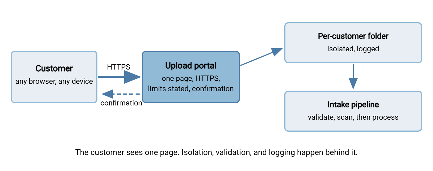
The diagram below shows the shape worth keeping in mind throughout this article: the customer sees one friendly page, and everything protective happens behind it.
Account Access or Link-Style Access
The first real design decision: does the customer log in, or do they use a per-request path you hand them? Both are legitimate; they fit different sender populations from the scenario catalog.
Account access means the customer holds a username and password with you. It gives the auditor strong attribution — every upload belongs to an authenticated identity. It also gives the recurring customer a stable place. The print-shop client who sends artwork weekly logs into the same folder each time and can see what they already delivered. The cost is ceremony. Credentials must be created, delivered, remembered, and reset. The reset burden lands on your support desk. That is why accounts belong to recurring senders, and why the whole account lifecycle gets its own article. On the server side, per-account authentication is standard territory. A product like Sysax Multi Server authenticates against its own built-in accounts or your Windows and Active Directory users. It gives each account its own isolated folder with its own permissions, so one customer can never list another's files.
Link-style access means the customer receives a specific path — typically a unique web address, sometimes with a short code. The path is created for one case or one request, and it expires when its purpose is served. There is no password to forget, which for a one-time claimant is the entire point. Attribution comes from your side of the counter: your staff created that access for that case, so whatever arrives on it belongs to that case. The risks are equally clear: a link can be forwarded. So it must grant as little as possible (upload-only, into one folder, for a limited time). And expiry must be designed, not hoped for. If the platform you build or buy offers per-request links, judge it on exactly those controls: scope, expiry, and logging of every use. A link that never expires is a public folder with extra steps.
| Question | Accounts | Per-request links |
|---|---|---|
| Best for | Recurring senders (data feeds, regular deliverables) | One-time and occasional senders (claims, case documents) |
| Attribution | Authenticated identity per upload | By issuance: your record ties access to case |
| Customer effort | Credentials to keep and reset | Click and upload |
| Main risk | Reset burden; dormant accounts accumulating | Forwarding; links that never expire |
| Must be designed | Lifecycle: create, support, retire | Scope, expiry, per-use logging |
Staff-issued case accounts are the productive middle path when the platform at hand only speaks accounts. Your team creates a real, individual account scoped to one customer's case — its own credentials, its own isolated folder. The team hands it to the customer ready to use, then retires it when the case closes. The customer never registers anything; the auditor still sees an authenticated, per-customer identity on every upload. It costs your staff a provisioning step. That is exactly the kind of repeated work worth templating. The account lifecycle article of this series takes up that topic in earnest, and provisioning transfer accounts has already built the template for it.
Many organizations correctly end up with both models: accounts for the recurring population, issued access for the one-time population. What fails is the single lazy default — forcing registration on everyone (abandonment) or handing out one shared "uploads" credential to every customer (no isolation, no attribution, and a password that effectively becomes public). A shared account is the worst of both models and deserves to be named as the anti-pattern it is. I have inherited one; its password was also the guest wifi.
Say the Limits Out Loud
Every portal has limits: a maximum file size, a set of accepted types, perhaps a per-case file count. The design sin is not having limits — it is revealing them only at the moment of failure. Picture a customer who spends twenty minutes on a cellular connection uploading a video. Only at the end are they told that the limit is a quarter of its size. That customer has been mistreated by your design, and your support desk will hear about it. Do not let the progress bar make promises the server will not keep.
State the limits on the page, before the file picker, in customer words: "Photos and PDF documents, up to 200 MB each." Enforce them as early as technically possible. The page itself can check a chosen file's size and type before any bytes travel, and the server enforces them again regardless. Page-side checks are a courtesy, never a control. The enforcement story is in intake validation and safety. Derive the limits from the worksheet in the problem-statement article rather than inheriting a platform default. If claims videos routinely run to half a gigabyte, a default sized for documents will manufacture failures all day.
Meridian Parts found its limit the cheap way, in testing. The returns portal had inherited a platform default of a few tens of megabytes, sized for documents. The first internal tester filmed a damaged gearbox on a phone in the warehouse, then walked back to the office on the cellular connection. The tester watched the upload fail at the very end with a message that mentioned neither size nor video. The worksheet from the problem-statement article had recorded "typical file: a short video" in the customer's column. Nobody had compared that line with the platform default. The limit was raised, stated on the page in plain words, and enforced before the first byte moved rather than after the last. The gearbox in the video, for the record, turned out to be fine.
The wording around the limits is part of the design. Here is a complete, copyable block of portal page text you can adapt. Note that it answers, in order, the four questions every customer silently asks: what do you want, what will it accept, what happens next, and what do I do if it goes wrong.
UPLOAD PAGE TEXT  (adapt per scenario)

  Send us your documents
  ----------------------
  Please upload the documents requested for your case.

  * Accepted: PDF, JPG, PNG — up to 200 MB per file
  * You can upload several files; add them one at a time
    or select more than one.
  * Tip: a clear phone photo of a document is fine.

  What happens next: you will see a confirmation on this
  page for each file, listing its name and size. We check
  every file automatically and attach it to your case;
  your case handler is notified the same day.

  Trouble uploading? Email the file's NAME (not the file)
  to support@<yourcompany> with your case number, or call
  <number>, and we will help directly.
Two details in that block earn their place. The "tip" line pre-approves the thing customers are most unsure about (phone photos), heading off both hesitation and phone calls. And the trouble line asks for the file's name, not the file. That keeps the fallback channel from quietly becoming an unscanned email intake for the very content the portal exists to receive safely. Fallback channels become main channels the moment they are easier.
Confirmation: The Cheapest Support Ticket You Will Ever Prevent
After the upload, the customer needs one thing: certainty that it worked. Deny them that and they act rationally — they upload again (duplicates), email the file as well (shadow copy), or call to ask (ticket). Silence after upload is one of the top ticket generators in customer exchange, and the whole family is dissected in reducing the support load. The portal's job is to make success unmistakable:
- Confirm on the page, per file: name, size, and a plain statement — "Received: photo-of-invoice.jpg (4.2 MB)." A spinning indicator that simply disappears is not a confirmation.
- Give a reference when a human may follow up: a case number or receipt line ("Received, 3 files, ref UPLOAD-8146") turns a later "did you get my files?" call from an investigation into a lookup.
- Set the expectation for what follows: "Your case handler is notified the same day." Customers do not expect instant processing; they expect to know the file did not fall into a void.
Confirmation has an internal twin: your side must notice the arrival too. A portal that receives files nobody looks at merely relocates the silence. The clean pattern is automation watching the upload area. A folder-monitoring tool such as Sysax FTP Automation can watch for new arrivals, move them onward on schedule, and send a notification to the owning team. So the case handler learns of the delivery without anyone polling folders. The "notified the same day" promise on the page is kept by machinery rather than by memory. Memory has the worst uptime of any notification system I have run.
Remember: a customer who cannot tell whether the upload worked will resolve the doubt at your expense — duplicate uploads, parallel emails, or a phone call. Per-file confirmation with a reference, plus an automated notification to your own staff, is the cheapest support-load reduction in the whole design.
The Mobile Reality
Assume the phone is the primary device, because for several scenarios it is. Claims photos are taken on the phone that uploads them, and case documents are increasingly photographed rather than scanned. Designing for that reality means respecting what phones are like:
- The file picker is the camera roll. Choosing "the PDF from the email" is genuinely hard on a phone; photographing the paper is easy. Accept common image formats and say so, rather than demanding PDF and forcing customers through a conversion they do not know how to do.
- Connections are slow and interruptible. A cellular upload of a large video takes minutes and dies when the customer switches apps or walks to the car. Show real progress and keep the limit honest. For scenarios with genuinely large files, favor mechanisms that tolerate interruption. The options are surveyed in large files over HTTP.
- Screens are small and fingers are wide. One column, large buttons, the upload control visible without scrolling, no hover-dependent hints — hover does not exist on a phone.
- Test on an actual phone on a cellular connection. Not the office network, not a resized desktop window. The portal that sails on the LAN and dies at one bar of signal in a parking lot is a recurring character in support queues.
Walk the whole mobile journey, too, not just the page. The typical path starts in the customer's email app: your message with the upload link, tapped on a phone. The link often opens in the email app's own embedded browser rather than the phone's main one. Embedded browsers are more limited and occasionally mishandle file pickers or large uploads. So test that exact route, and keep the link plain and copyable. That lets a customer open it in their real browser when the embedded one misbehaves. The email itself is part of the portal. Keep it short, from an address that matches your organization, naming the case. Keep the link visible rather than buried under a button image that looks like every phishing attempt they have been warned about. If your own upload email looks like phishing, the awareness training worked.
The Security Floor Under the Friendly Page
None of the friendliness above excuses the floor the auditor stands on; the trick is implementing it so customers barely feel it. HTTPS-only, always — no plain-HTTP fallback for the page or the upload. Use authentication appropriate to the access model, with lockout behavior tuned for customers. Throttling that slows a password-guessing bot is essential on an internet-facing page. But thresholds must forgive the legitimate customer's three fumbled attempts. The balance is designed in lockout and throttling design. What a lockout feels like from both sides is covered in authentication failures and lockouts. Where a portal serves a small, known population — a handful of recurring data-feed customers — IP allow and block lists add a quiet network-level layer. That layer is invisible to the customers it admits and unavailable to everyone else. And everything logs: every login, upload, and download recorded, because the portal is the attributable front door the whole governance story leans on.
One more floor item hides in plain sight: the page should look like you. Customers asked to upload sensitive documents to a bare, generic login screen quite reasonably hesitate — "is this phishing?" is a real ticket category. Whether you build the page or front a product's web interface with your own, treat visual continuity with your main site as a design requirement. That means the name, logo, and consistent address customers can verify. For whatever you deploy, this is not a cosmetic afterthought.
A Portal Design Checklist
PORTAL DESIGN CHECKLIST

ACCESS
[ ] Access model chosen per scenario: accounts (recurring)
    / issued per-request access (one-time) / both
[ ] No shared credentials across customers — ever
[ ] Per-customer isolation: each sender sees only their own area

THE PAGE
[ ] Size + type limits stated in customer words, before the picker
[ ] Limits sized from real files, not platform defaults
[ ] Phone-photo guidance included; common image formats accepted
[ ] Works one-handed on a phone; progress visible; no hover hints
[ ] Looks like your organization; address customers can verify

AFTER THE CLICK
[ ] Per-file confirmation: name, size, plain "received"
[ ] Reference number shown when humans will follow up
[ ] "What happens next" sentence sets the expectation
[ ] Staff notification automated on arrival — no folder polling
[ ] Fallback help channel that does NOT invite emailing the file

THE FLOOR
[ ] HTTPS only; no plain-HTTP path
[ ] Lockout/throttling tuned for customers, not just attackers
[ ] Every login and transfer logged
[ ] Uploads land outside processing — intake pipeline next
The Portal Is Half the Story
A portal designed this way — browser-only, access matched to the sender, limits said out loud, success unmistakable, mobile-first, floor intact — turns the counter interaction from a gamble into a routine. But everything it accepts is still an untrusted file from an unmanaged device, sitting in a landing area. The other half of the design is what happens in the seconds and minutes after arrival: enforcement, scanning, quarantine, and normalization, covered next in validating and sanitizing customer uploads. And if your portal will use accounts, their whole life — creation, resets, dormancy, retirement — is designed in customer accounts: create, support, retire. The customer in the parking lot will read neither. That is the point.
Frequently Asked Questions
Why not just give customers SFTP access instead of a web portal?
Should every customer get their own account?
What file size limit should an upload portal have?
What should the customer see after a successful upload?
Can customers upload malware through a portal?
From the Sysax team: we build secure file transfer software for Windows. Sysax Multi Server is an FTP, FTPS, SFTP, and HTTPS server. Sysax FTP Automation handles scheduled, scripted transfers. Free trials are on the download page.